Coffee Journal

Maybee.......a seed is all it takes.
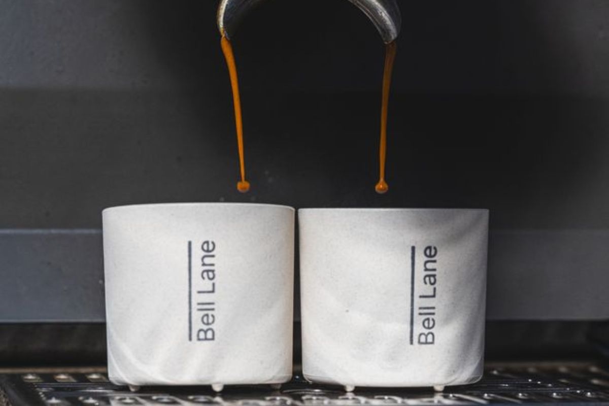
Every Bell Lane coffee order in May includes a pack of native Irish wildflower seed bombs from our partners at Design by Nature. Bee populations across Ireland are under real pressure. And the conn...
Discover more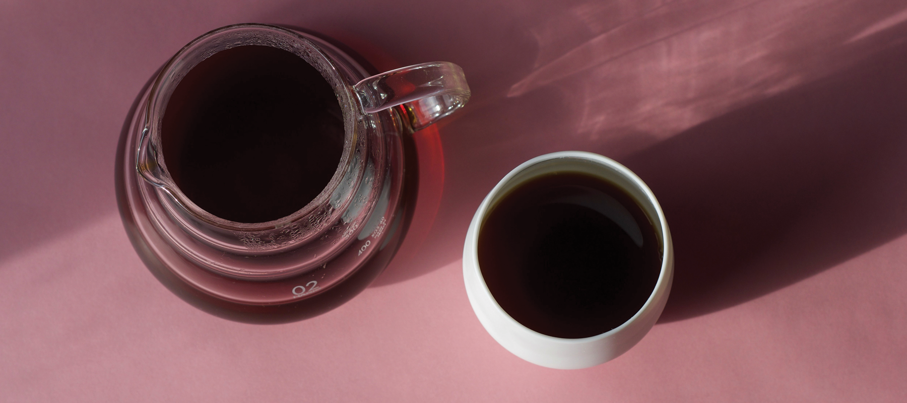
A Simple Valentine’s Gift Guide ☕️
Whether Valentine’s Day is your thing or very much not your thing, we’ve put together a small list of thoughtful gifts we genuinely love.They’re simple, meaningful, and designed to be enjoyed slow...
Discover more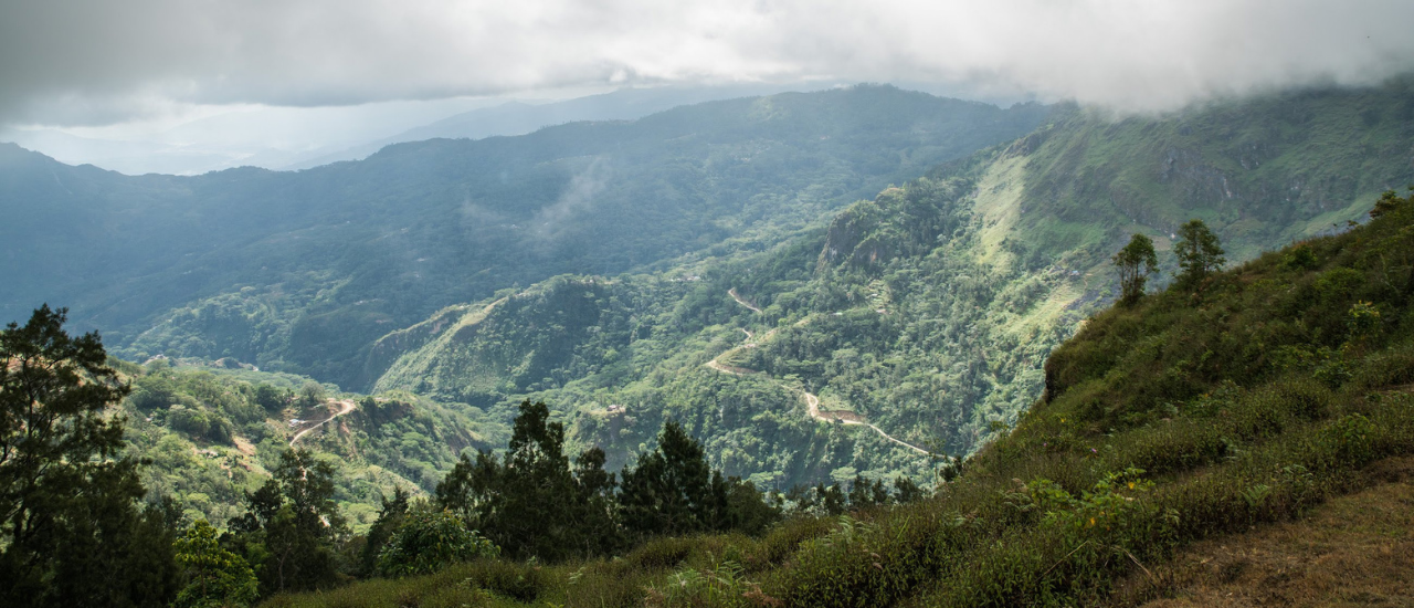
Planting the Future: The 11 Million Trees Project
At Bell Lane, we know that coffee can be a force for good, especially for the communities and ecosystems that produce it. That’s why we're proud to back the 11 Million Trees Project in Timor-Leste,...
Discover more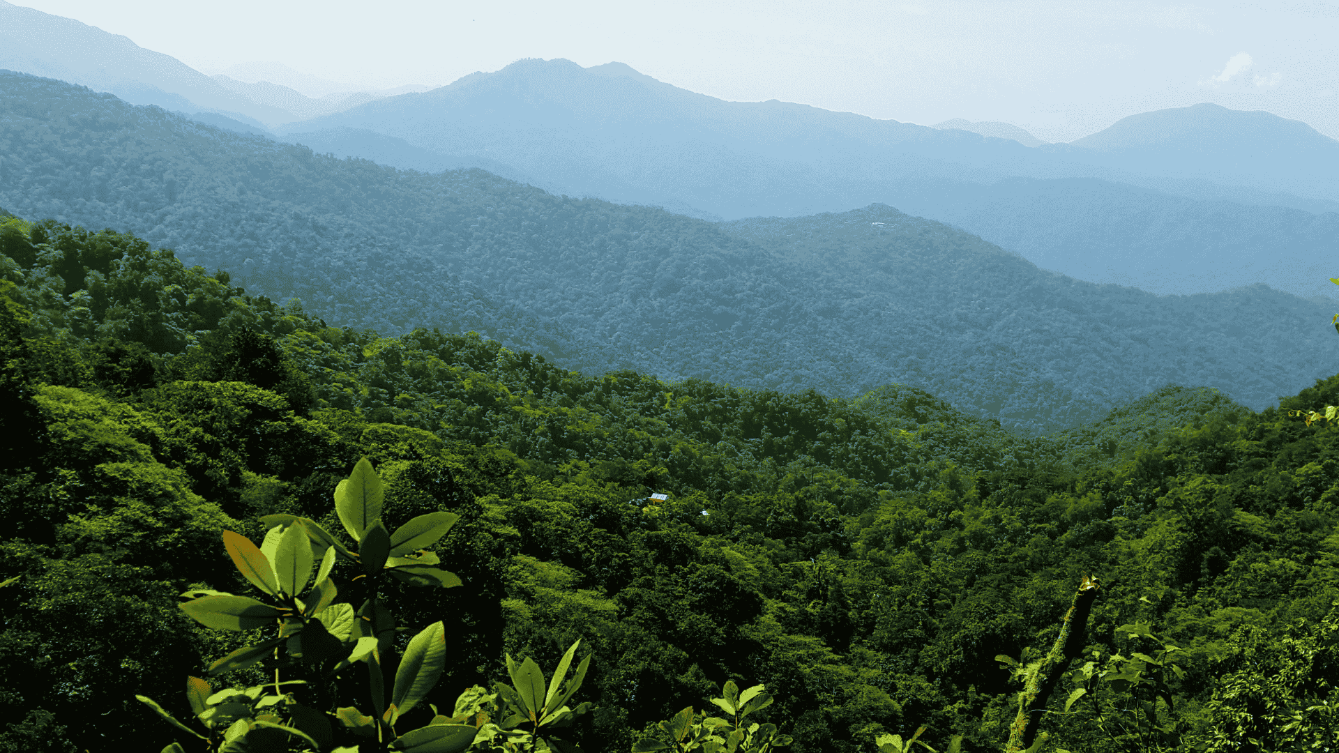
What's So Special About Specialty Coffee?
If you’ve heard the term specialty coffee before, but aren't exactly sure what it means, you’re in the right place. Here we'll take a look at specialty coffee's origins, what defines it, and what r...
Discover more
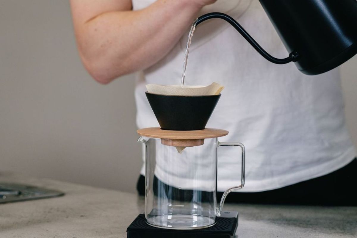
How To Brew A Great V60 At Home (No Experience Needed)
So, you’ve decided to dive into the world of filter coffee. Great choice. Previously, we've looked at the differences between filter and espresso. In this post, we’re getting hands-on with one of t...
Discover more
Why Giving A Voice To Coffee Farmers Matters
Coffee has always been about people, whether meeting for coffee or chatting over coffee. But for this special collaboration, we’re shining a light on the people behind coffee—the producers, farmers...
Discover more
Understanding Washed Coffees (And Why We Love Them)
When it comes to discovering new coffees, processing method is one of the most powerful (and underrated) keys to flavour. Among all the options, we keep coming back to washed coffees for their cla...
Discover more
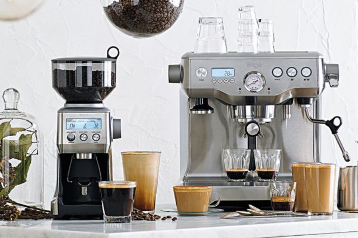
Espresso Vs. Filter: What's The Difference And Why Does It Matter?
If you’re just getting into coffee, you’ve probably heard people talk about filter and espresso. But what exactly sets them apart? And more importantly, which one is right for you? what is espresso...
Discover more
4 Easy Iced Coffee Recipes To Cool Down With
When the heat is on, nothing beats an iced coffee. These four summer-ready recipes are easy to make (and delicious to drink). There's something for you whether you prefer espresso, filter, and even...
Discover more
How Our Hessian Sacks Are Helping Bees
This May, we’re celebrating “Maybee” for the fourth year running—a small but important way Bell Lane Coffee is giving back to nature. As part of the initiative, we'll be including native Irish wil...
Discover more
meet the artist behind our labels
Meet Paul Flaherty—artist, in-house creative, and all-round coffee head. Paul is the creative force behind our new labels, blending a deep understanding of coffee with a distinctive visual approach...
Discover more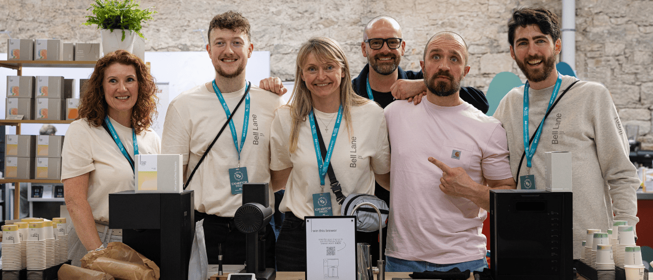
taking it easy at dublin coffee festival 2025
As lead coffee roaster sponsor at Dublin Coffee Festival, we knew we had an important role to fill—and plenty of prep to do. the venue Held in the historic RDS in Dublin across the weekend of Ap...
Discover more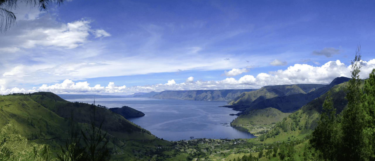
indonesia's blue batak and its 13th century roots
High above the southern edge of Lake Toba in North Sumatra—home to the largest volcanic crater lake in the world—you’ll find the ancestral lands of the Batak people, where coffee has been grown for...
Discover more
Coffee In Colour: The Story Behind Our New Labels
This is a project we’ve been working on for a while.And while you can see the end result on our packaging, we wanted to take you behind-the-scenes to explain how this change happened—and the thinki...
Discover more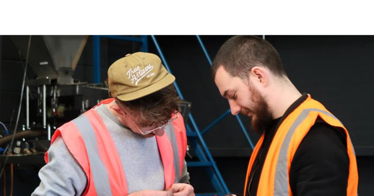
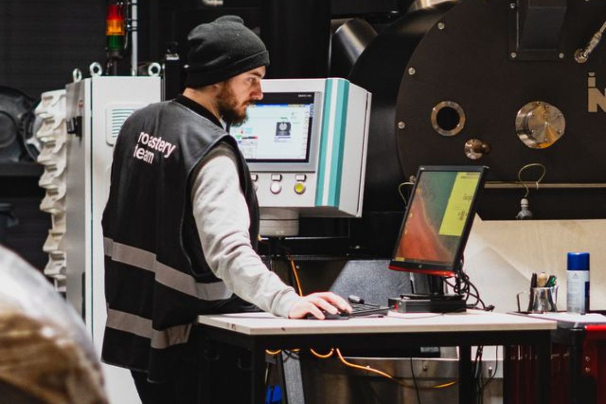
how our roastery team made the move to a 4.5-day workweek
by Tess Martin, Warehouse & Logistics Manager at Bell Lane Coffee Roasters One of the biggest changes we made recently was moving from a 5-day to a 4.5-day workweek in our roastery. It’s a move...
Discover more
behind the bar: corkbeg coffee
Like the winding road to Whitegate in East Cork, Gráinne Gormley’s journey to opening Corkbeg Coffee was full of twists and turns. With a background in food and hospitality—including nine years ru...
Discover more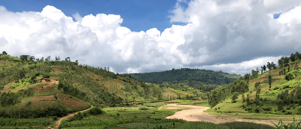
5 tips for a smoother b corp journey (from someone who’s been there)
by Denise Bell, Co-Founder of Bell Lane Coffee Roasters In May 2024, Bell Lane officially became a Certified B Corp. As I reflect on the process, there are a few things I wish I’d known from the st...
Discover more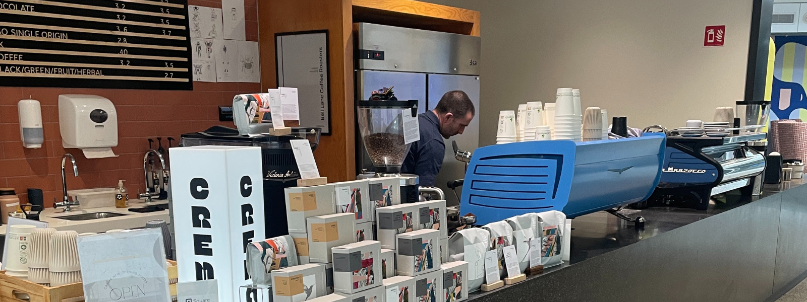
Nestled in the heart of Meta’s Dublin offices, Crema Coffee is a cornerstone of the company’s coffee scene. Owned and led by Anthony Ryan, his own lunchtime coffee trips during a previous role ...
Discover more
gail's top 20 tips for aspiring baristas
With years of hands-on experience in coffee—training baristas, running workshops, home brewing, and everything in between—Gail Henshall has a wealth of barista tips and tricks up her sleeve. Beyond...
Discover more
the changing face of the coffee market
Like many industries, the coffee industry is going through a period of change right now. Extreme weather is affecting supply, while global demand continues to rise. At the same time, economic shift...
Discover more

Evalynn: Chapter Three of Our Journey
What may look like a simple co-branding project is, in fact, the culmination of years of collaboration, shared passion, and a commitment to excellence in specialty coffee. Welcome to chapter three ...
Discover more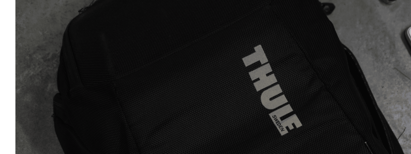
what's in my bag: a coffee salesman
by Stephen Bell, Co-Founder of Bell Lane Coffee Roasters As a salesman on the road, your bag becomes more than just a carryall—it’s an extension of your day-to-day operations, a survival kit,...
Discover more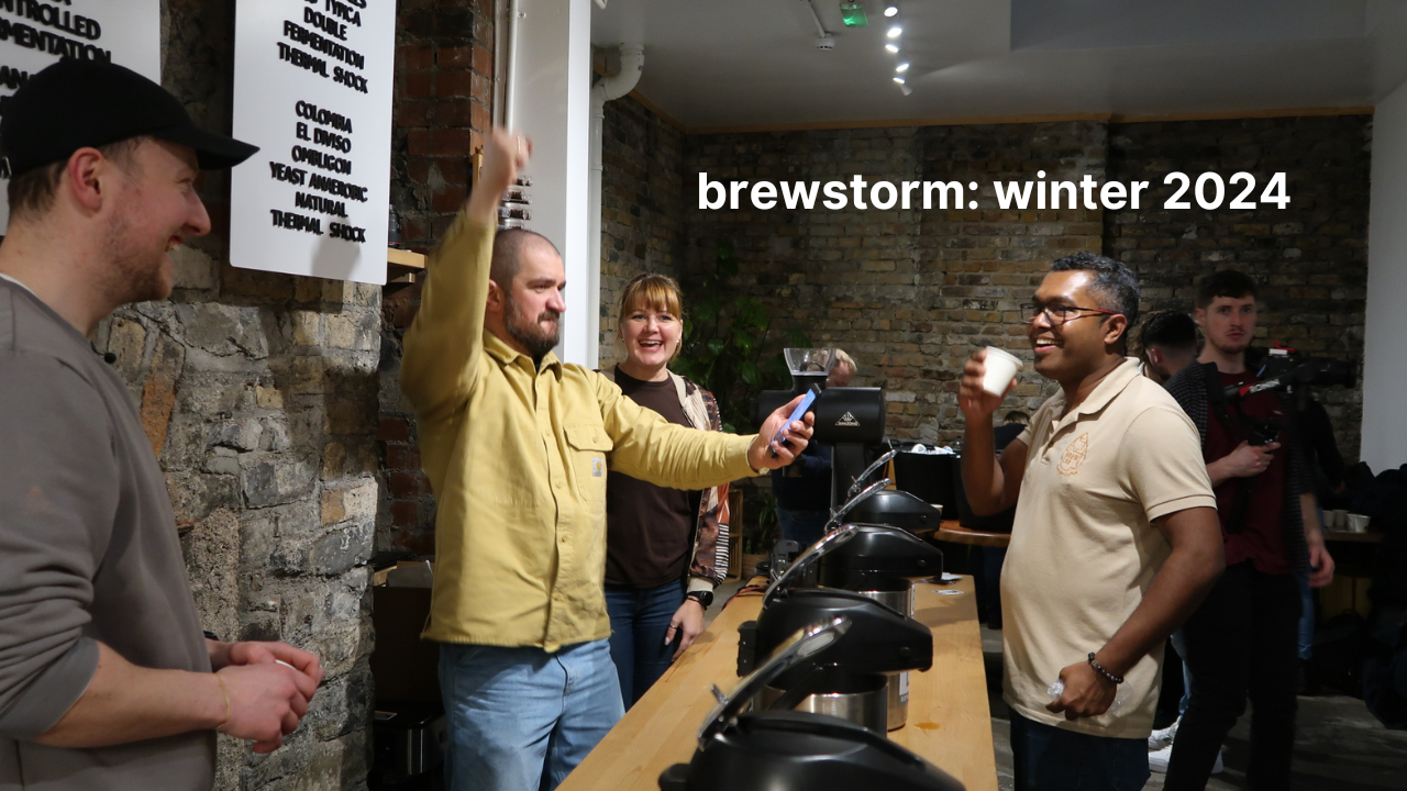
brewstorm recap: celebrating coffee and community Coffee is much more than a drink – it’s an excuse to connect, converse, and get creative. That’s why we were excited to host our Brewstorm commu...
Discover more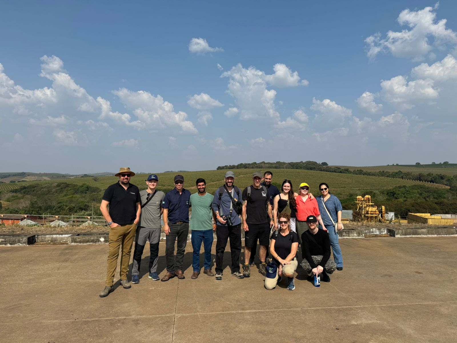
Sustainable Farming in Focus: Gail’s Visit to Brazil’s Coffee Producers
At Bell Lane Coffee, we believe that exceptional coffee begins with strong relationships at its source. In this blog, we take you through Gail's journey to Brazil, where she connected with passiona...
Discover more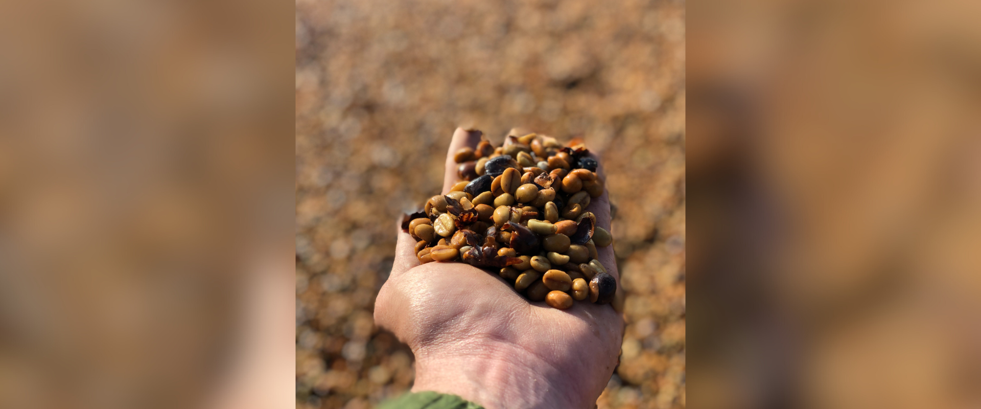
International Coffee Day - Taster Pack
Niko shares a brief overview of the Taster's Pack for International Coffee Day, featuring three exceptional coffees from Peru, Burundi, and Colombia. This collection offers a unique opportunity to ...
Discover more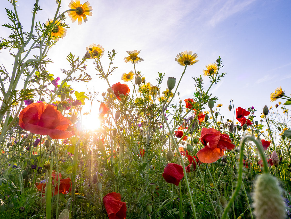
As we kick off the third year of our MayBee campaign, we're buzzing with excitement and gratitude for the incredible journey we've shared with our community. What started as a small idea has blosso...
Discover more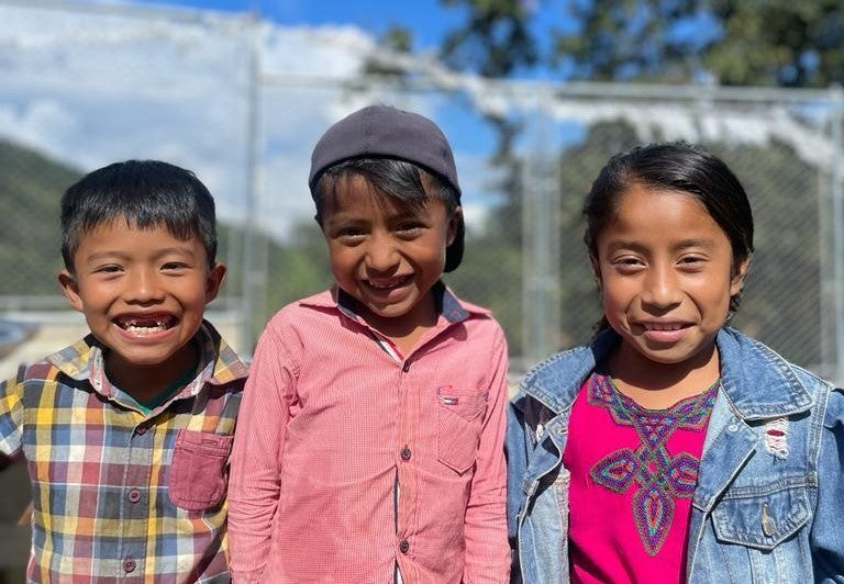
In the past, we have avoided talking about the important stuff – the good work we do behind the scenes. With our recent rebrand, we're committed to being open and honest, sharing our stories and em...
Discover more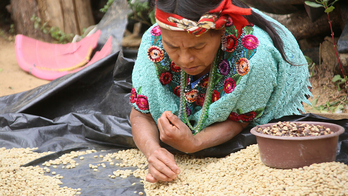
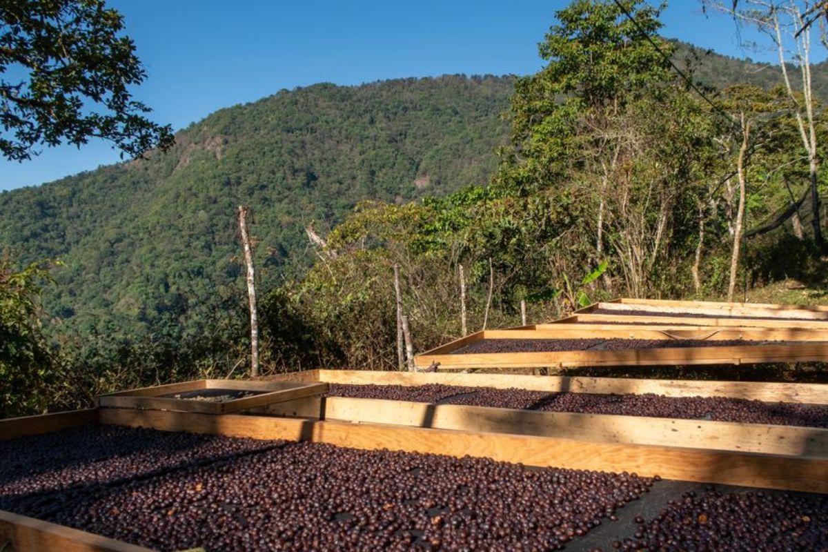
La Morena - Empowering Women Farmers
In Guatemala, the coffee industry is male-dominated and gender equality remains a challenge. Even though women operate 20% to 30% of Guatemalan coffee farms (and up to 70% of coffee production wo...
Discover more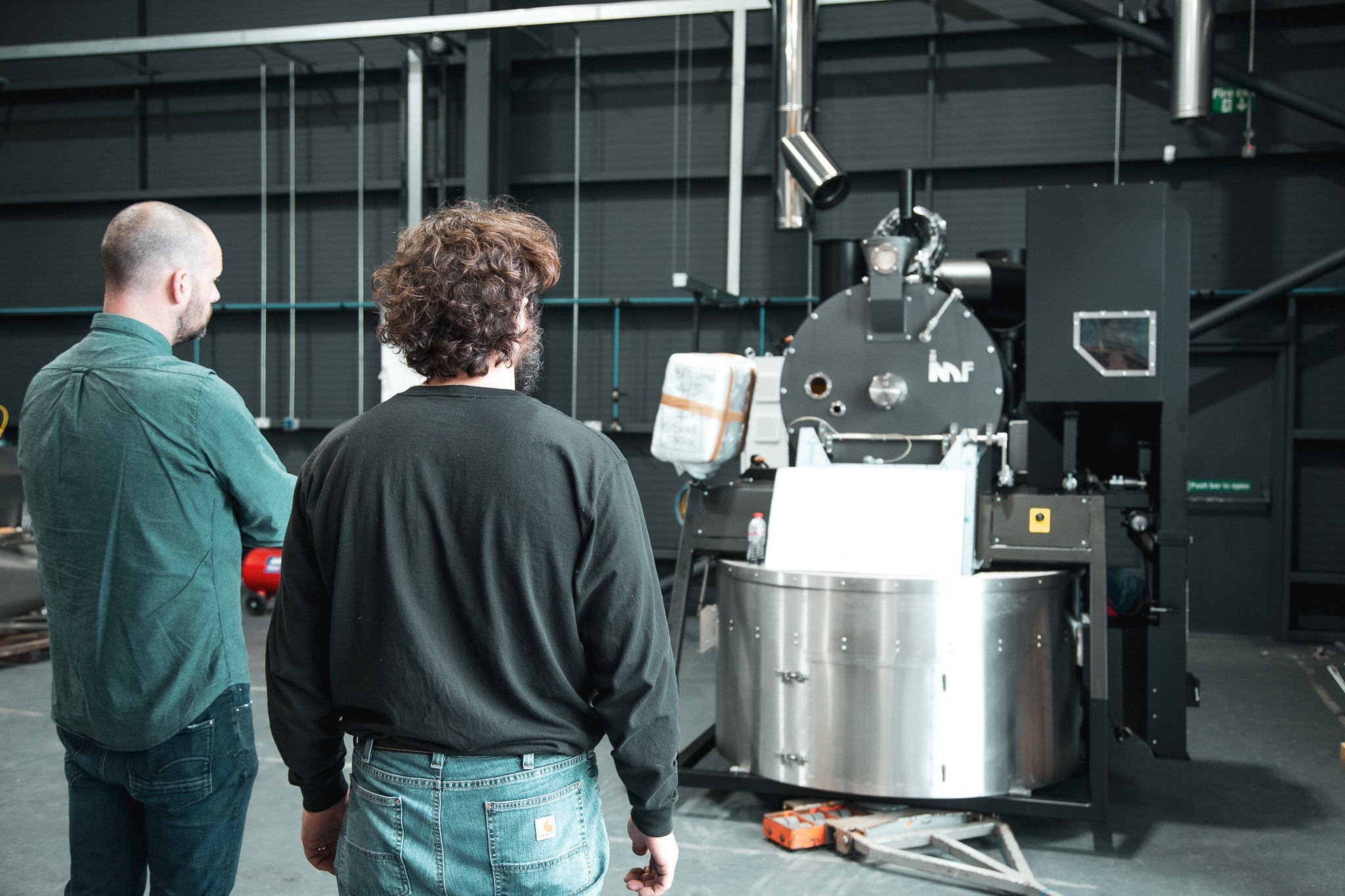
Choosing a new roaster is a big challenge for every roaster. It is likely that your decision will impact above all else the profile of every roast, workflow, and day to day operation in the roaster...
Discover more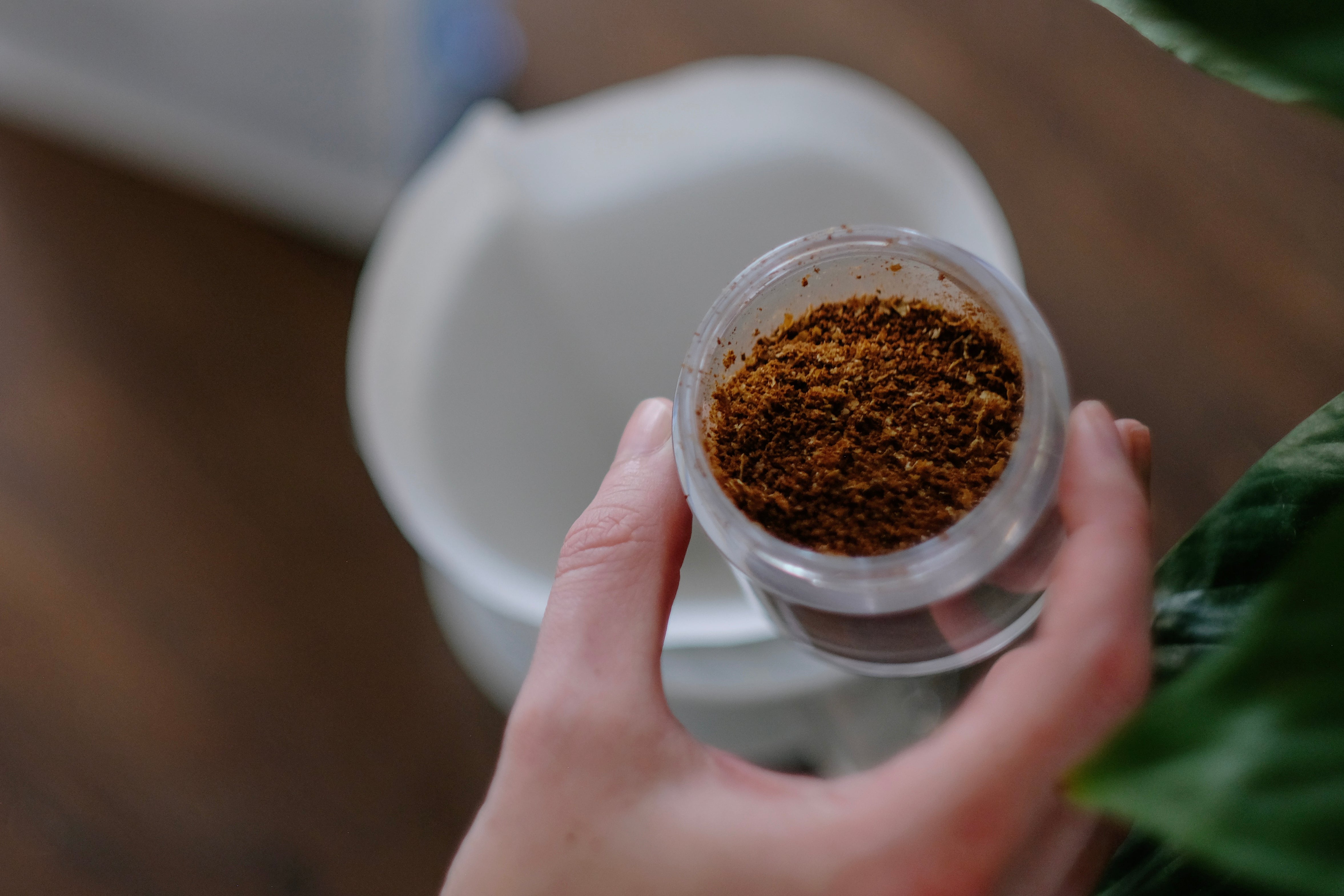
Ultimate Coffee Freshness - Dissolving the Myth
There is a current misconception that the fresher the coffee is, the better. Well, we're here to bust that myth wide open and explain what fresh-roasted coffee really means so you can enjoy your br...
Discover more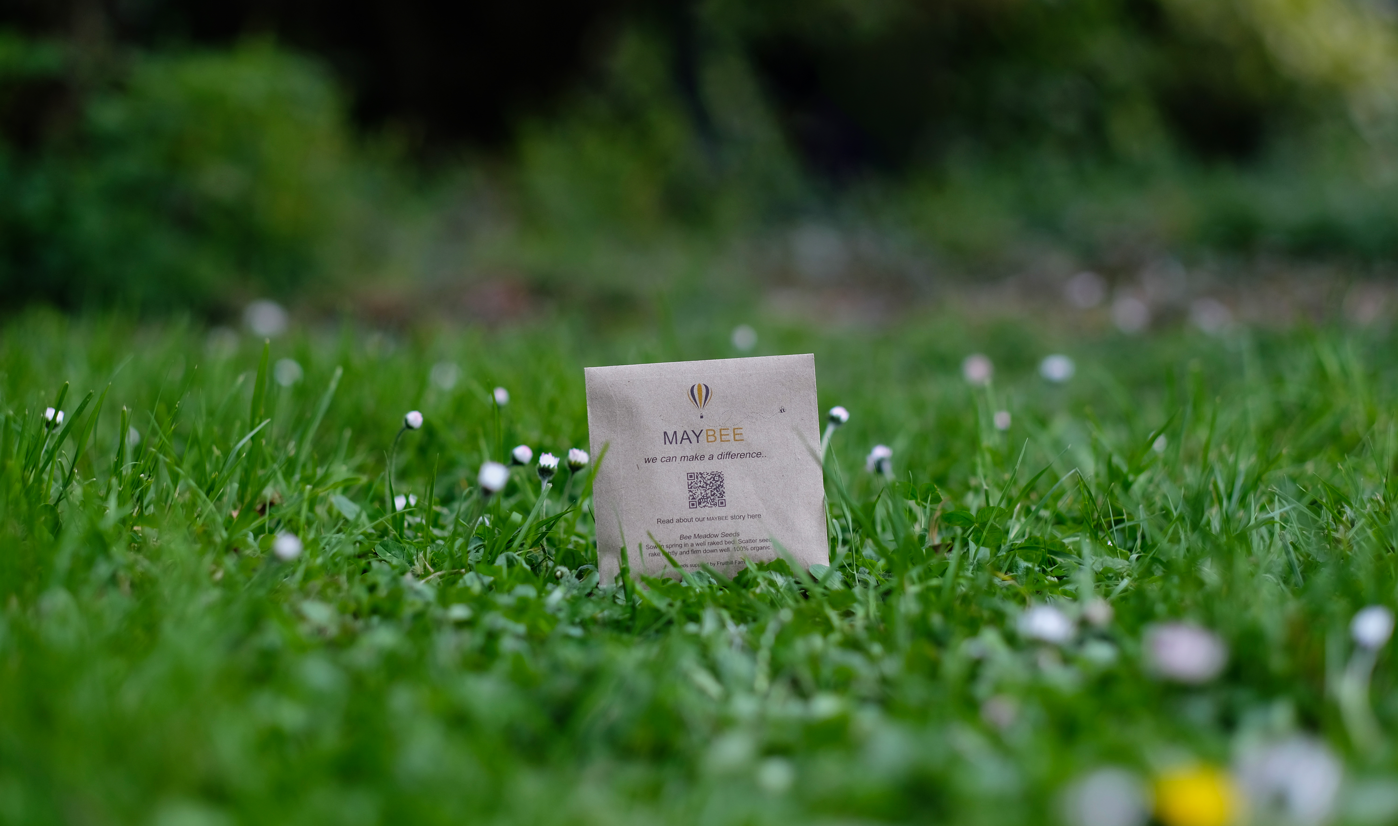
Last year, we began our MayBee campaign as a small initiative with a potentially huge impact. Our plan was to distribute packages of coffee across the country, with an added element that could invo...
Discover more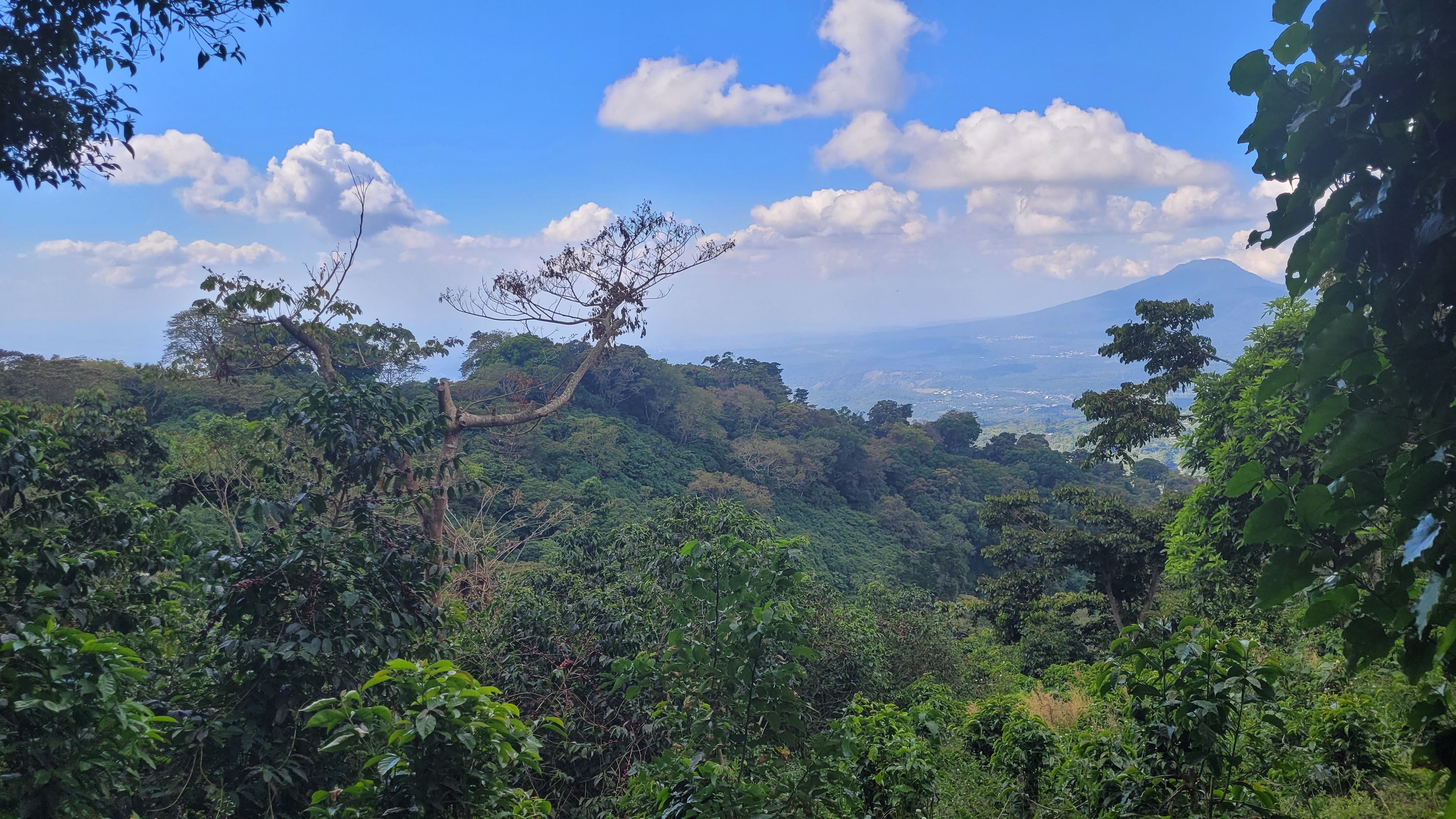
Bell Lane & Evalynn - Origin Trip to El Salvador 2023
Completing the coffee circle, producer, roaster & coffee partner. Goran, our account manager, along with Niall, owner of Evalynn Coffee shop, recently travelled to El Salvador to meet coffee p...
Discover more